
QR Code Tips That Actually Help
Best Practices To Improve Scanning, And Engagement
Design Best Practices
Good QR code design is not just about appearance. It directly affects scan accuracy, user trust, and campaign performance. Even a small design mistake can reduce scan rates or make the code unreadable.
If you want better results, follow these proven QR code design best practices that improve scannability and user experience.
Maintain a Proper Quiet Zone
Every QR code must have empty space around it. This area is called the quiet zone. Without it, scanners may fail to detect the code correctly.
According to QR code standards, the quiet zone should be at least 4 modules wide on all four sides. A module is one small square inside the QR pattern.
A missing quiet zone is one of the most common reasons QR codes fail.
Best practices:
- Leave clear white space around the code
- Do not place text, borders, or graphics too close
- Avoid decorative frames touching the QR pattern

Keep the QR Code Perfectly Square
QR codes must always remain square. Stretching or compressing changes the internal grid structure and reduces readability.
Best practices:
- Horizontal stretching
- Vertical squeezing
- Extreme rotation
- Placing on curved surfaces without testing
Use High Resolution for Print and Digital
Low quality images reduce scan success, especially in printed materials.
Recommendations:
- Use SVG format for print whenever possible
- Avoid downloading compressed screenshots
- For print, export at 300 DPI
- Test before bulk printing
Choose the Right Error Correction Level
QR codes include built-in error correction. This allows the code to remain scannable even if partially damaged.
There are four levels:
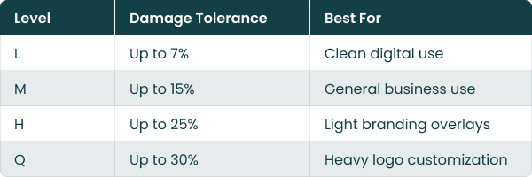
If you plan to add a logo in the center, use higher error correction such as Q or H.
However, higher correction increases data density, so balance customization with clarity.
Avoid Overloading the QR with Too Much Data
The more data you store in a QR code, the more complex the pattern becomes. Dense QR codes are harder to scan.
Instead of embedding large text blocks or long URLs:
- Use short URLs
- Prefer dynamic QR codes
- Redirect to a landing page
Simpler QR structures scan faster and more reliably.
Test in Real Conditions
Designing on screen is not enough.
Before final use:
- Test on Android and iOS
- Test under low light
- Test from expected scanning distance
- Test after printing
A QR code that works perfectly on your laptop may fail in real world conditions.
Why Design Best Practices Matter
Well-designed QR codes improve:
- Scan speed
- First-time scan success
- User trust
- Campaign performance
- Brand credibility
Poor design leads to missed scans, lost leads, and wasted marketing spend.
Following these QR code design best practices ensures your QR codes are not only attractive, but reliable and effective.
Color & Contrast Guidelines
Color plays a major role in QR code scan success. While custom colors help match your brand identity, poor contrast is one of the biggest reasons QR codes fail to scan.
For a QR code to work reliably, scanners must clearly detect the difference between the foreground pattern and the background. If the contrast is too low, reflective, or reversed incorrectly, users will struggle to scan it.
Below are practical color and contrast guidelines that improve scan accuracy while keeping your QR visually appealing.
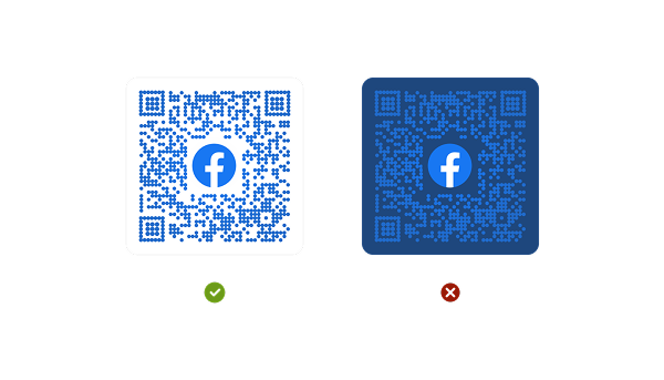
Keep the Background Light and Solid
Busy or textured backgrounds reduce detection accuracy.
Recommendations:
- Use a plain, solid background
- Avoid gradients behind the QR
- Avoid placing QR over photos
- If using background color, ensure strong contrast
If you must place a QR on an image, add a white box underneath it to maintain clarity.
Avoid Inverted QR Codes Without Testing
An inverted QR code is light pattern on a dark background. Some modern scanners can handle this, but not all perform equally.
If using inverted colors:
- Test on multiple devices
- Increase contrast further
- Avoid complex gradients
Standard dark-on-light designs remain the most reliable.
Do Not Use Transparent QR Codes
Transparent or semi-transparent QR codes reduce clarity.
Avoid:
- 50% opacity overlays
- Faded pattern designs
- Background blending effects
QR codes should always remain visually strong and defined.
Follow Basic Contrast Rule
The QR pattern should be significantly darker than the background.
Best combinations:
- Dark blue on white
- Dark green on light background
- Deep maroon on beige
- Black on white
Avoid:
- Light gray on white
- Yellow on white
- Pastel on pastel
- Neon on neon
Strong contrast improves:
- Scan speed
- First-attempt success rate
- Outdoor performance
- User confidence
- Campaign results
Branding Tips
A QR code should not look like a random black box placed on your design. When branded correctly, it becomes a natural extension of your identity and builds trust before users even scan it.
At the same time, branding must never reduce scannability. The goal is balance. A branded QR code should be visually aligned with your business while remaining easy to scan on the first attempt.
Add Your Logo Carefully
Adding a logo in the center of a QR code increases brand recognition and trust. People are more likely to scan a QR code when they recognize the brand behind it.
However, logo size matters.
Best practices:
- Keep the logo within 20 to 30 percent of the total QR area
- Use high error correction level if adding a logo
- Ensure the logo does not cover finder patterns
- Keep strong contrast between logo and background
Match Brand Colors Without Reducing Contrast
You can use brand colors for the QR pattern, but clarity should always come first.
Guidelines:
- Use darker brand shades for the pattern
- Keep background light and clean
- Test your color variation on multiple devices
- Avoid gradients inside the pattern
Your QR should look branded, not decorative.
Customize Frame and Call-to-Action
Adding a frame around the QR improves clarity and engagement.
Example CTAs:
- Scan to Explore Our Collection
- Scan for Exclusive Offer
- Scan to Download Our App
A clear instruction increases scan rate because users know what to expect.
Frames also help the QR stand out on posters, packaging, and banners.
Keep Finder Patterns Recognizable
The three larger squares in the corners help scanners detect the QR structure. These are called finder patterns.
You can style them slightly, but:
- Do not remove them
- Do not distort their shape
- Maintain strong contrast
- Maintain strong contrast
- Avoid replacing them with complex icons
Too much customization here can break functionality.
Maintain Professional Appearance
Avoid:
- Over-decoration
- Excessive icon overlays
- Animated backgrounds behind QR
- Cluttered surrounding design
Your QR code should feel intentional and trustworthy.
Size Recommendations
QR code size directly impacts scan success. A code that is too small becomes unreadable. A code that is too large without proper testing may reduce usability in close environments.
Whether you are printing on packaging, posters, business cards, or banners, following proper QR code size recommendations ensures fast and reliable scanning.
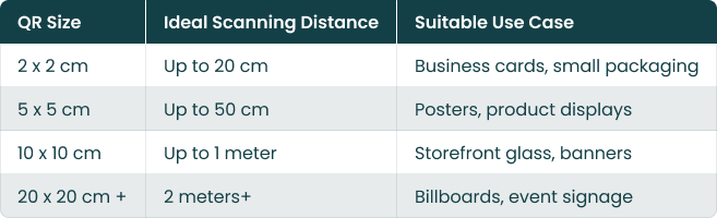
Minimum Size for Print
For most printed materials, the recommended minimum QR code size is:
2 x 2 cm (0.8 x 0.8 inches)
This works well for close-range scanning such as:
- Product packaging
- Flyers
- Business cards
- Table tents
Anything smaller increases the risk of scan failure, especially on lower-end mobile cameras.
Use the 10:1 Scanning Distance Rule
A practical formula used in the industry:
Scanning distance ≈ 10 times the QR code size
Examples:
- 2 cm QR can be scanned from about 20 cm away
- 5 cm QR can be scanned from about 50 cm away
Anything smaller increases the risk of scan failure, especially on lower-end mobile cameras.
Adjust Size Based on Data Density
QR codes that contain more data become visually denser. Dense codes require larger print sizes to remain scannable.
If your QR includes:
- Long URLs
- Embedded text
- High error correction level
- Logo overlay
Increase the size slightly to maintain clarity.
Test the Printed Version Before Mass Production
Even if the digital file looks correct:
- Print a sample copy
- Scan from realistic distance
- Test under indoor and outdoor lighting
- Check from multiple device types
Small print errors can become large campaign failures.
Placement Guidelines
Even a perfectly designed QR code can fail if it is placed poorly. QR code placement plays a major role in scan rate, user convenience, and campaign performance.
People scan QR codes when it feels easy, natural, and safe. If they have to bend, zoom, step back too far, or struggle with lighting, they will simply ignore it.
Place at Eye Level Whenever Possible
For public environments, the ideal placement is between chest and eye level.
Recommended height range:
- 3.5 to 5 feet from the ground for indoor displays
- Slightly higher for storefront glass
Eye-level placement reduces friction and increases spontaneous scans.
Avoid:
- Placing too low near the floor
- Placing too high where users must stretch
- Placing behind counters where access is restricted
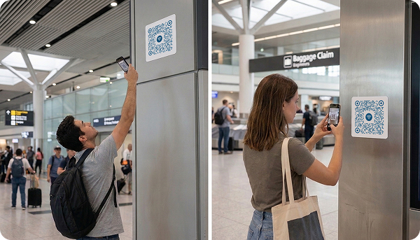
Ensure Comfortable Scanning Distance
Users should not need to:
- Stand too close
- Step too far back
- Block walkways
- Enter unsafe areas
Follow the 10:1 size-to-distance rule mentioned earlier. If your QR is visible from 1 meter away, ensure it is large enough to support that distance.
Placement should always match size.
Avoid Curved or Uneven Surfaces
Curved surfaces distort the QR grid structure. This affects detection accuracy.
Avoid placing QR codes on:
- Bottles with strong curvature
- Rounded packaging edges
- Folded corners
- Creased paper
If unavoidable, increase size and test thoroughly.
Do Not Place in Visually Cluttered Areas
If surrounded by too many graphics, patterns, or text, the QR code loses visibility.
Best practices:
- Give breathing space around the code
- Avoid placing inside dense text blocks
- Separate from busy backgrounds
- Make it visually stand out
Users should immediately recognize the QR without searching for it.
Add Context Near the QR
Placement works best when supported by a clear message.
Instead of placing only the QR, add:
- A short instruction
- A benefit-driven line
- A small icon indicating scan action
Tips for Higher Scan Rates
Creating a QR code is easy. Getting people to scan it is the real challenge.
Higher scan rates depend on three main factors: visibility, motivation, and trust. If users clearly see the QR, understand what they will get, and feel safe scanning it, engagement increases significantly.
Always Add a Clear Benefit-Driven Call to Action
QR codes without instructions are often ignored. Users need a reason to scan.
Instead of just placing the code, add a strong message:
- Scan to Get 15% Discount
- Scan to View Menu
- Scan to Download Free Guide
- Scan for Exclusive Offer
A clear benefit increases action.
Campaign studies consistently show that QR codes paired with clear instructions perform better than codes placed without context.
Offer a Real Incentive
People scan when they gain something valuable.
High-performing incentives include:
- Discount coupons
- Free downloads
- Loyalty points
- Event access
- Giveaway entries
If the reward is weak, the scan rate drops.
Make the value clear and immediate.
Make the QR Visually Stand Out
If users cannot notice it, they cannot scan it.
To increase visibility:
- Use contrast with surrounding elements
- Add a frame around the QR
- Keep enough white space
- Avoid blending into background
The QR should be instantly recognizable from a distance.
Place QR Codes in High-Traffic Areas
More visibility equals more opportunities.
Effective locations include:
- Store entrances
- Product shelves
- Event registration desks
- Checkout counters
- Packaging front panels
Placement influences scan rate as much as design.
Track and Optimize
You cannot improve what you do not measure.
Monitor:
- Total scans
- Unique users
- Scan time patterns
- Device types
- Geographic data
Data helps you identify what works and what needs improvement.
Create Your Trackable QR Code for Free
Create dynamic QR codes, track performance in real time, and optimize campaigns with actionable data.
Security & Privacy Tips
QR codes are convenient and powerful, but security and privacy should never be ignored. Users scan QR codes expecting a safe and trustworthy experience. If a QR leads to a suspicious or unsafe page, trust is lost immediately.
Always Use Secure HTTPS Links
The destination URL should always begin with https://.
Secure HTTPS links:
- Encrypt data between user and server
- Increase browser trust
- Reduce risk of data interception
- Improve credibility
Modern browsers may warn users if the page is not secure, which reduces engagement instantly.

Avoid Linking to Suspicious or Unknown Destinations
Users hesitate when redirected to strange-looking domains.
Avoid
- Random shortened links
- Misspelled domains
- Overly long confusing URLs
- Domains unrelated to your brand
Best practice:
- Use branded domains
- Display your website name near the QR
- Keep URLs clean and recognizable
Clear destinations build confidence before users even tap.
Protect Dynamic QR Destinations
If you use dynamic QR codes, secure access to your dashboard.
Security recommendations:
- Use strong passwords
- Enable two-factor authentication
- Limit team access permissions
- Monitor activity logs
If someone changes your QR destination without authorization, it can lead to serious trust damage.
Regularly Monitor QR Destinations
Security is not a one-time setup.
Periodically:
- Test the QR link
- Ensure the page loads correctly
- Confirm it has not expired
- Check for broken redirects
Inactive or incorrect destinations reduce credibility.
Common Mistakes to Avoid
Many QR campaigns fail not because QR technology is weak, but because of avoidable mistakes in design, placement, or strategy.
If your QR code is not getting scans, the issue is usually one of the following common errors. Avoiding these mistakes can dramatically improve scan rate, user trust, and campaign performance.
Making the QR Code Too Small
One of the most common QR code mistakes is using a size that is difficult to scan.
If users must move too close or adjust their phone repeatedly, they will give up.
Avoid:
- Tiny QR codes on packaging
- Very small codes on posters
- Shrinking dense QR codes
Follow minimum size guidelines and test before printing in bulk.
Ignoring the Quiet Zone
QR codes require white space around them. Without this margin, scanners struggle to detect the pattern.
Common mistake:
- Placing text too close
- Cropping edges during print
- Adding decorative frames that touch the code
Always keep proper spacing on all sides.
Using Low Contrast Colors
Low contrast is one of the biggest reasons QR codes fail to scan.
Avoid:
- Light colors on light backgrounds
- Pastel on pastel combinations
- Glossy reflections
- Transparent overlays
Strong contrast improves first-attempt scan success.
Linking to a Non-Mobile-Friendly Page
Most QR scans happen on smartphones. If your landing page is slow or not optimized for mobile, users leave immediately.
Common issues:
- Slow loading time
- Small unreadable text
- Complicated forms
- Too many pop-ups
Mobile optimization directly impacts conversion rate.
Not Testing Before Launch
A QR code that works on your laptop may fail in real-world conditions.
Common oversight:
- No test print
- No multi-device testing
- No outdoor lighting test
- No scan distance test
Always test in the same environment where it will be used.
Using Static QR Codes for Campaigns That Need Tracking
Many businesses use static QR codes and later realize they cannot track performance.
If you want insights such as:
- Number of scans
- User location
- Device type
- Campaign effectiveness
Use dynamic, trackable QR codes from the beginning.
Letting QR Links Expire or Break
Broken links damage trust instantly.
Regularly check:
- Destination URL
- Redirects
- Hosting status
- Domain validity
A non-working QR code makes your brand look unprofessional.
Start For Free With Digital QR
Create high-quality QR codes in seconds with unlimited static scans forever.